VISUAL LANGUAGE
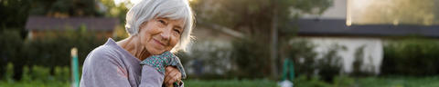
The Schwabe visual language is natural and authentic, it has a high proportion of green and is characterised by warm light. Image sections focussing on a plant can create more excitement.
The images chosen should emphasise the message of the accompanying statement. Strongly coloured motifs, such as overly colourful flower meadows, should be avoided.
Landscape
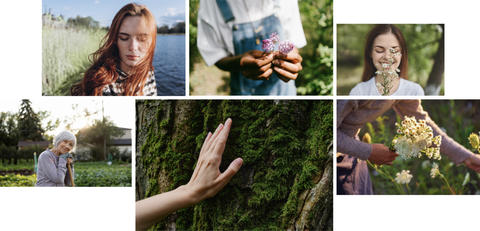
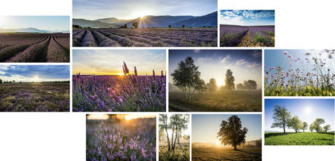
Calm, warm lighting moods focussing on the plant describe the landscape and nature shots. Low sunlight can create additional lighting effects. A reference to plants used in our products should be aimed for where appropriate.
Trees or other plans that symbolise nature in general can stand for Schwabe. However, pure fruit trees should be avoided.
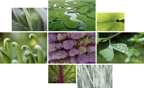
Abstract
Abstract nature shots can be created using top views or macro shots of plant details. The pictures are characterised by interesting structures. Green tones also dominate in these shots.
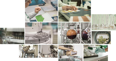
Images of the manufacturing process and production facilities should be reduced in saturation as uniformly as possible and kept rather cool. The motifs can be tinted slightly green, but care must be taken to ensure that important product and original colours are retained.